Showing posts with label Palette. Show all posts

Beauty Bay X Nikkie Tutorials Palette | Review

I received the Beauty Bay x Nikkie Tutorials eyeshadow palette as a gift recently, and although I have never watched her personally (I've heard a lot of good things though), I was really interested in the palettes design anyway. I love the contrasting features. If you have never seen this palette before one side is dark and mysterious and the other half is bright and vibrant. These are reflected in the shades which lie underneath the specific sides of the palette. The left side is full of bright shades, containing light blues, yellows and pinks. While the other half is dark with reds, browns and greens. So you could use either sides for different looks depending on what you are feeling on a specific day. You could mix the two sides together to create a full look also as the middle of the palette blends the palette together to keep it cohesive.


I love the duality of the palette. It has some shades which I feel are not usually included in a regular palette. I love the deep red, Mikai, the light blue, Plot Twist, and the bright orange, Redemption, as they are colours I haven't seen in a palette I own. They're all very vibrant so this palette is very good value if you love to play with colour and different designs. The darker shades are very pigmented and they may be a little bit harder to take off, which is both a good and bad thing. The shimmer shades are very pretty on also and they don't dull when put on.


The palette includes 20 pressed pigment shades altogether. They do seem like a random mix of shades but I do think they go together well. I think it's a good mix of neutrals and bright shades. It sometimes seems hard to see how they all go together but I think seeing shades that seem in a random place, help to show how you can experiment and combine different colours. I do like to use colour, but I usually tend to to stick to a neutral base. 

Above swatches are in order top row; Redemption, Bend & Snap!, Ivy, Slasher, and 5am

Second row; Roxy Catan, VLA, Mikai, Mila, and Underground.

Third row; Plot Twist, Aura, Basic Trut, All-in, and Ew.

Last row; Pride, Zomer, Mama Tutorials, Amsterdam, and Mr Tutorials.

Has anyone tried this palette before? What do you all think?


Anastasia Aurora | Highlight Palette Review

I found this palette recently at my local TKMaxx, and thought that it was a good price for it, but it turned out that they were selling it at the same retail price as usual so it was a little disappointing. The palette is the Anastasia Beverly Hills Aurora highlighter palette. They call it a glow kit which is probably more apt, as this palette is glowy for sure. 


This palette contains six shades of different highlight shades. I love this because usually with highlighter you only get a light white highlight but this palette has lots of different shades which can give different hues for different looks. There are two beige colours, one blue, one white, one purple and one a mix of blue and beige. Eclipse is the most neutral of the shades and will blend into your skin the most natural if you have pale tones. Luna is a white shade which gives the brightest shimmer on the cheek. Spectra is the darkest shade in the palette but on the skin it isn't as purple as it looks, it leaves a purple hue but in a clear shimmer. These shades are amazing in different lights. Helia is very bright also and comes out a lot whiter than the whiter shade but the shimmer colours change. Orion is a blue shade and it is again light on the skin but enough to leave an icy finish. Lyra is the most orange and gold shade and leaves a gold finish on the skin.


I love this highlighter palette and if you love a good shimmer and a strong highlight I would highly recommend this palette. It has such good pigmentation and you can layer it easy. It picks up on camera really nicely too.

Swatches are in order, Eclipse, Luna, Spectra, Helia, Orion and Lyra.

Has anyone tried this palette before? What are your thoughts?

Lime Crime Venus XS Solid Gold | Palette Review

I have never had any LimeCrime eyeshadows before but I have used a lot of their lip and face products and I've loved them. The Venus XS palette that I have is the Solid Gold palette. There are many different versions and colours of these palettes and I think that this one is the most neutral and natural. 


The palette, as suggested in the name is very small. It's about the size of a palm. It only contains four shades but it has enough to create various looks. It has one light white beige, two browns, a light and dark, and a gold shade. All of the shades are shimmer or glitter shades except for one matte shade.


Gilded is the gold glitter shade which contains chunks of glitter as you spread. Aureate is the light gold white shade, which would work as a highlight shade as it changes in the light. Treasure is the dark brown shade which contains flecks of gold sparkle. Lastly Trinket is the matte brown which is the most basic of all the shades.


The swatch above is of Trinket, Aureate, Gilded, and Treasure in order. 

I would love to try the other colour palettes in this collection as I think they are great to carry around and complete a full look with so little shades and effort. Has anyone tried this or similar before?

Clear Out My Make Up With Me

Now is more than time more than ever before that the majority of us have a lot of time to do a huge clear out. Of which I have done several times now. I decided that my makeup needed a huge clear out, mainly because a lot of it must be really out of date by now and I had a lot of stuff that I just never used or reached for over others. I did clear every section of my collection but I only remembered to take a photo of my palettes that I am getting rid of. I thought it'd be nice to share things that I once really enjoyed, and also never used so others get an idea of what is a good product overall.


The first few things I got rid of are a few old Zoeva products, ones I'm not too sure if they do anymore. These palettes are very cheap and I love the quality of Zoeva's products. All of the palettes that I used are very neutral and are great for everyday looks. I decided to get rid of these palettes as they are at least five years old and I don't go for neutrals as much as I used to but I would consider getting them again but maybe in different colours.

The Naked 2 palette was one that really got me into makeup and I also had 1 a long time ago, this palette is the oldest I own and I don't use it for that reason. It is an iconic palette and I'll never forget the hype and the craze all of these palettes created in the beauty world. I do think that they have gotten better as they have gone on too.

The NYX palette is one in which you bought individual colours and assembled your own palette. I loved the idea of this at the time and NYX products are amazing value for what they are. I never used this palette and I think it is because none of the shades I picked went together and I never remembered what was inside the palette.

The Revolution palette was gifted to me buy a friend as far as I remember and I really liked it but the colours never really drew me to the palette and I forgot I owned it. It has some very unusual colours that I like and I do think I would buy it if it were better quality again, it reminds me of the Subculture palette by Anastasia. Which I just found out has been discontinued after a quick google, so I am sad about that.

The last two items in this pile that I cleared were a Benefit blush and Primark highlight palette. Blush is never something that I use, which I probably should, but it was never used so I knew that I would never use it. The highlighter is very good and very pigmented, and smells like chocolate. But I have a lot better highlighter palettes that  I would rather keep instead.


Has anyone else been doing a lot of clearing out? Find any old gems?

Pastel Goth Kat Von D | Palette Review

It's my first post back and I have a lot of products that I have tried over the past year that I have been AWOL. The palette that I have used the most recently is Kat Von D's Pastel Goth palette. When trying to link this product it seems that it has been discontinued on Kat Von D's website -  but is still available on a few others. I was really drawn to this palette as every single colour in the palette was a shade that I did not already own. Being pastel and rainbow coloured was really appealing for me as I was trying to expand on my makeup skills and looks and therefore this palette was an instant hit. Although I wasn't anticipating to wear it as frequent as any other neutral shade palette I own. 


There are only eight shades in this palette which makes it quite small - yet each shade is very different from the next which gives it extra versatility. The shades are all pastel versions of the colours mainly found in a rainbow. As they are pastel I assumed they would be slightly muted in colour - yet was I extremely wrong. The colour pay-off of these shades is amazing. The consistency is very chalk like which is a little strange but it really allows the colours to stand out when applied. If using this palette using Skull - the white shade as a base is also a good idea for giving stronger colour pay-off for the other colours. The weird thing about this palette is that I'm using shades like green and blue like they were a casual brown or beige and I'm loving it. My most used and favourite shades are Star, Clementine and Meow (the first three shades) as wearing them all together makes a really beautiful sunset eye.


The below swatches are of the palette in order - although the quality of the picture is not the best. You can see in the picture that the shades are very chalky and look subtle but vibrant in shade. They look so much better on the eyes than on my arm I can confirm. This is the first Kat Von D palette I own and the quality is definitely worth investing in. Her products are all cruelty free and vegan which makes it much more appealing to me also.


If anyone has any suggestions on which colour combinations I should try please comment below! And if anyone has tried this palette before what are your opinions?


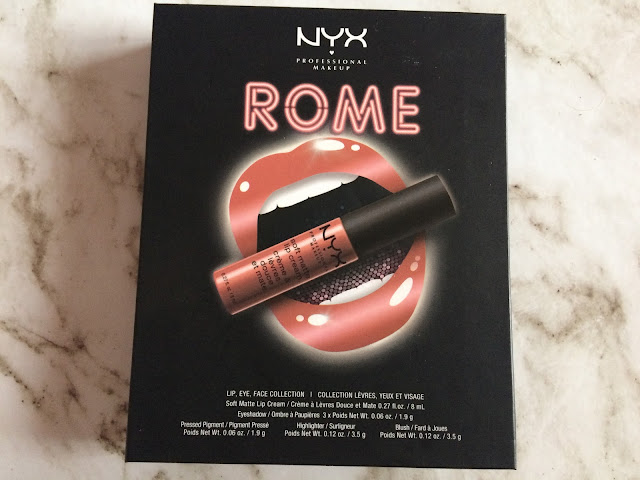
NYX Rome Set | Review

I'm a huge fan of NYX products so I'm always up to trying new stuff that they have, and they've had these little sets named after cities and I got the Rome one to test out. It contains four eye shadows, a blush, highlighter and a liquid lipstick, and it's a cute little set for essentials especially for travelling and having lots of things in the one place.


There's four eye shadows in the palette set but I don't know the individual names for them, they're only on the back of the palette as ingredients as a whole. There's two purple eyeshadows which I really like but they're very similar in shade, one has a gold glitter element and the other has more of a silver shimmer but other than that they could be the same. Theres a pretty shimmery gold and a coral peachy pink and they are nice together but not my favourite eyeshadows to wear. I find that NYX eyeshadows aren't very pigmented and are very hard to apply even if they're nice colours. These ones are quite nice but don't last very long but are nice for casual wear but not so much for a long time. 


The highlighter is a pale nude colour and it has a subtle shimmer, it's not what I'd normally go for in a highlighter but it's really nice to add a pop of shimmer to your cheeks. The blush is a similar texture and consistency it's more of a coral colour and adds colour but not too much which is something I like.

The liquid lipstick is in the shade Rome and it's quite a dark nude colour, it has red and purple undertones and it's really nice on. I love their soft matte lip creams, they're super creamy and smooth and can last a long time and even when they fade they fade out nicely.

(The swatches are of the eyeshadows, liquid lipstick in Rome, highlighter and blush)

Overall I think the colours and the idea of the set are really nice and they look really well together, they're both natural and a little bit darker too with the purples. I think it's a nice idea to have all these things in one set that you can bring around with you.

Has anyone else tried this or other ones? What do you think?

Subculture Palette | Review

Yes, I know the hype over this palette is long over, but I have a habit of buying products long after everyone else buys them. It's partly because if I still want it after a long period of time I know that I still want it, and I get to read more reviews and see if it's worth it. I've seen a lot of reviews about this product with people not liking it, the main reason is that it has a lot of fallout compared to its counterpart, the Modern Renaissance palette, but although I agree with that, I still have a lot of love for the product and thought I'd still give my own review. 


The ABH Subculture palette, along with the Modern Renaissance palette, are both two palettes that have stood out to me as ones that I needed to have. The selection of colours in each is amazing, and so different to others out there. Although I think the Modern Renaissance palette is more versatile in terms of neutral, bright and normally more wearable shades, I loved and love the contrasts and choice of colours in the Subculture palette. Admittedly, I don't wear darker colours often as I'm always afraid of not being able to blend them right or making a mess. Yet I thought that the colours in this would be great for experimenting and seeing what I could come up with, which might be a good blog post idea for the future, let me know what you think.


There's eleven matte shades and three shimmer shades in this palette, and it comes with a a mixture of light and dark colours that seem a little odd with each other. The actual pigmentation of this product I like, yes I agree that there is a lot of fallout, as you can see from having been used in the photos, yet if you are gentle with the product, it's not too bad. Maybe they've changed the formulation since its first release. The product is creamy and powdery at the same time, which makes it easy to blend and mix together. I find that even a little product is very pigmented and they come out the same colour as in the pan.

My favourite shades from the palette are Edge, which is a bright yellow, which is similar from ones in the Modern Renaissance palette. I also like Untamed, a green and dark blue pigment, Cube, which is an iridescent white with a colourful shimmer, and Electric, which follows its name, a sparkly gold yellow. I like to use this palette especially on nights out and I've loved trying different combinations out so far.


The swatches above are of the top row of the palette, in order, Cube, Dawn, Destiny, Adorn, All Star, Mercury, and Axis.
These swatches are of the second row in the palette, in order, Roxy, Electric, Fudge, New Wave, Untamed, Edge, and Rowdy.

Has anyone tried this palette before? What do you think of the shade range and pigment?

BH Cosmetics Galaxy Chic Palette | Review

I normally don't rush to buy products as soon as I see them, but I saw this palette on Instagram recently and I searched and ordered it straight away. It's the BH Cosmetics Galaxy Chic palette, I love it so much as all the eye shadow shades are based and inspired by planets. If anyone knows me, they'll know that I love astrology and the stars, I'm so fascinated and intrigued by them, and this palette is just captures the sky so beautifully. I'm pretty sure this is the prettiest palette I own, in my opinion.


I've never tried any BH Cosmetic products before, but I'm always up for trying new brands. I don't tend to stick to the same things, unless they're amazing staples. As I've mentioned before, the palette is based off the planets and astrology. The cover of the palette isn't that exciting or amazing but it's what's on the inside that matters. Plus it's always a bonus when a palette comes with its own mirror, makes things so much easier, especially on the go. The palette contains eighteen shimmery eyeshadow shades, which makes sense as the sky and stars shine. I love how the shades fit their names so well, and that the palette contains a good variety of colours, all very wearable, some more for nights out than others. 


Some of my favourite shades are Milky Way, which is a lilac with light pink and white swirls throughout, it's literally so pretty. Also Asteroid and Mercury which are similarly mixed shades that are just so aesthetically pleasing, with various colours shooting through them. Meteor, Electra and Sun are my other favourites and ones I've probably worn the most. 


The quality and pay-off of these shadows is incredible, they're strongly pigmented, and very dramatic and shimmery, yet easily blend-able. They blend and come off the brush gently and easily, a little definitely goes a long way. They're both creamy and chalky, and just the right amount of shimmer. It's not crazy glittery, but the shimmer looks so cool under lights and when your eyes are closed, but it's not too intense for during the day. Although, some shades are more shimmery than others. I love the mix of pale and dark colours too, they go well together and it's prefect to bring for any occasion. 

Shades above are Sun, Jupiter, Prometheus, Aphrodite, Milky Way, and Cosmic.  

Shades above are Saturn, Venus, Meteor, Comet, Earth, and Neptune. 

Shades above are Mercury, Mars, Asteroid, Electra, Moon, and Pluto.

Overall, I love this palette, both to look at and to wear. I think if I were to design a palette, it would be something like this. I really love the theme and the colours that were chosen, plus the colours last a long time without smudging or fading, I'd highly recommend this palette.
What do you guys think of this palette? Have you tried it or any BH Cosmetics products before? 

Urban Decay Alice in Wonderland | Review & Swatches

I'm super excited to write this post but I've taken so long to get around to doing it. I also know this isn't a very new palette anymore but I couldn't find it anywhere for a good while. When I saw that Urban Decay were releasing another Alice in Wonderland palette I knew I was going to love it straight away. I am a huge Alice in Wonderland fan, I just love everything about it so a make up palette based on it yes please. As soon as I saw the pictures I fell in love with it, it's literally so pretty. It's based off the new Alice in Wonderland film Through The Looking Glass, which I actually never read which made it more exciting. I actually had the film in my June favourites. Anyway I've been trying out this palette for a few weeks and I thought I'd write what my opinions on it are and give it an honest review.


The palette comes in a box of the same design and you slide the palette out. The design is like looking through a kaleidoscope and has colourful flower like patterns but it's just so pretty I don't even know how do describe it. The side of the palette has the quote 'I know who I was when I got up this morning, but I must have changed several times since then' which is a classic Alice quote. Then when it's opened there's another quote which reads 'I'm not strange, weird, off, nor crazy, my reality is just different from yours' which is so cute, Alice in Wonderland has the most creative and cute quotes. I love them.


When opened the top section reveals a mirror which also has a quote on it of probably the most famous quote 'We're all mad here'. The mirror looks like the mirror from the film and has loads of clocks that are melting almost like Dali's famous painting. Underneath the quote you can open the sections to reveal a pop up butterfly from the book and film. It's such a beautifully designed intricate palette and although there's really no need for it to be so fancy and complicated for just being an eye shadow palette I think it suits the themes of the film well. Quite quirky, interesting and a bit different from your average palette and definitely a great collectors item.


The shades on the palette are all so vibrant and some are definitely some I'm going to have to work up the courage to wear out. Each column is based off a certain Alice in Wonderland character which I only realized after I bought it. The first is Alice, then the Mad Hatter, Mirana or the White Queen, Iracebeth or Queen of Hearts and Time. There is meant to be five complete looks in total which I like the idea of, although obviously there's more than five.


The first swatches are from the Alice shades in the palette, Looking Glass, Reflection, Dormouse and Metamorphosis. These colours definitely look like something Alice would wear and I think the subtle shades would go well with a pop of blue. The shade Looking Glass is probably the most faded and subtle of the palette and it's very hard to see it but the other shades are very easy to blend and I find them very pigmented and easy to use.


The swatches above are of the Mad Hatter look which not in Mad Hatter terms are very outgoing and crazy shades to pair with each other. Again it looks very like the Mad Hatter and I've seen some inspired looks with these shades which are just beautiful. The colours are Hatter, Gone Mad, Paradox, and Cake. I haven't used many of these shades yet, they'll probably be my least used shades but I do love Gone Mad which is a deep purple colour and I think it looks great applied under the lash line.


The next shades are based off the White Queen also known as Mirana. These are the most neutral and natural colours on the palette by far. The shades are Lily, Duchess, Kingdom, and Chessboard. These are my favourite shades in the palette. Lily is by far my favourite shade, when first applied it looks like a nice pale beige white then it turns into such a pretty duochrome eye shadow and it becomes a metallic pink in the light and I absolutely love it. If I could only wear one eye shadow for the rest of my life it'd be that one. Duchess is a great match with that shadow and its a pretty light orange gold, even though it seems more beige in the swatch.


The next swatches are of the Queen of Hearts or Iracebeth. The shades are Royal Flush, Salazen Grum, Bandersnatch, and Heads Will Roll. I love Salazen Grum it's the perfect shimmery deep red and looks so pretty. I haven't worn the blue and turquoise shades yet as I feel like they don't really suit my blue eyes, but they feel like good quality.


The last character shades are of Time. They're the darkest shades in the palette and they are Mirror, Chronosphere, Dream on, and Time. These shades are very pigmented and dark. I love the shade Dream On, even though it's the shade many people have said is disappointing. It's not very pigmented but it's still pretty but I can see why people complain about it. All the rest of the shades are very pigmented and soft. 

I know many people have said that this palette isn't up with usual Urban Decay quality and isn't worth the money but I think the eye shadows are very good quality. There's probably two shades on the palette, Looking Glass and Dream On, that I'm not entirely happy with but the rest of them are of high standard and Urban Decay quality. For me this palette is more about the design and detail than the actual eye shadow shades. They're all pretty eye shadows that are soft and easily blended, yet the design of shades for each individual character and the overall design of the palette makes it worth the money. 

I would recommend this palette for sure as it's probably my favourite as of now. Also perfect for my fellow Disney fans. Has anyone tried this palette or seen the new film? What do you think?